My role: UI UX designer
Kikoya is a company which has to this day three main products: A Lending Origination Platform (LOP), Kikoya HUB, a marketplace for automotive credits, and a Credit Quote maker.
First step for enhancing these products was to diagnose each of them. For this purpose, I reunited with Onboarding and Support stakeholders who revealed interesting data through in-depth interviews and some previous polls that were made to the clients that have abandoned Kikoya. Those were mainly financing institutions.
Kikoya users are divided into two groups: Financial employees, who in some cases follow up on all the credit leads, and credit applicants, who in some cases are responsible for their own application process. This is the case with HUB.
Whichever the case this is dependant on the financial company own workflow.
I initiated my process with a notion account that helped me create tasks as they were surging when the findings appeared. It’s a like a detective board.

Our firts clue was on the operations and support teams of HUB. e shared a slack channel for reporting in real-time all the issues and friction points that applicants were having when completing applications.
Less than 10% of applications was complete. This data was harvested manually and documented on a spreadsheet.
So to diagnose this phenomenon I analyzed the customer flow of any vehicle purchase of the portals that were implementing HUB. This was an opportunity to decide where to insert HUB flow optimally .

I investigated through in-depth interviews and a poll of 30 people looking for a better understanding of a car purchasing experience in Mexico.

As for HUB, the marketplace, there is a serious cultural problem. The user doesn’t know a priori their real payment capacity, so they usually initiate the purchase process by choosing a car first, leaving the financial institution of the car agency the first chance to set their main credit plan.
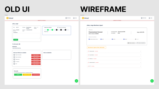
However, it was possible to control faster this funnel by enhancing the application user flow, which is the same for HUB and LOP. I performed a heuristics evaluation of the LOP platform as part of the diagnosis and documented all its flaws on a huge notion document.

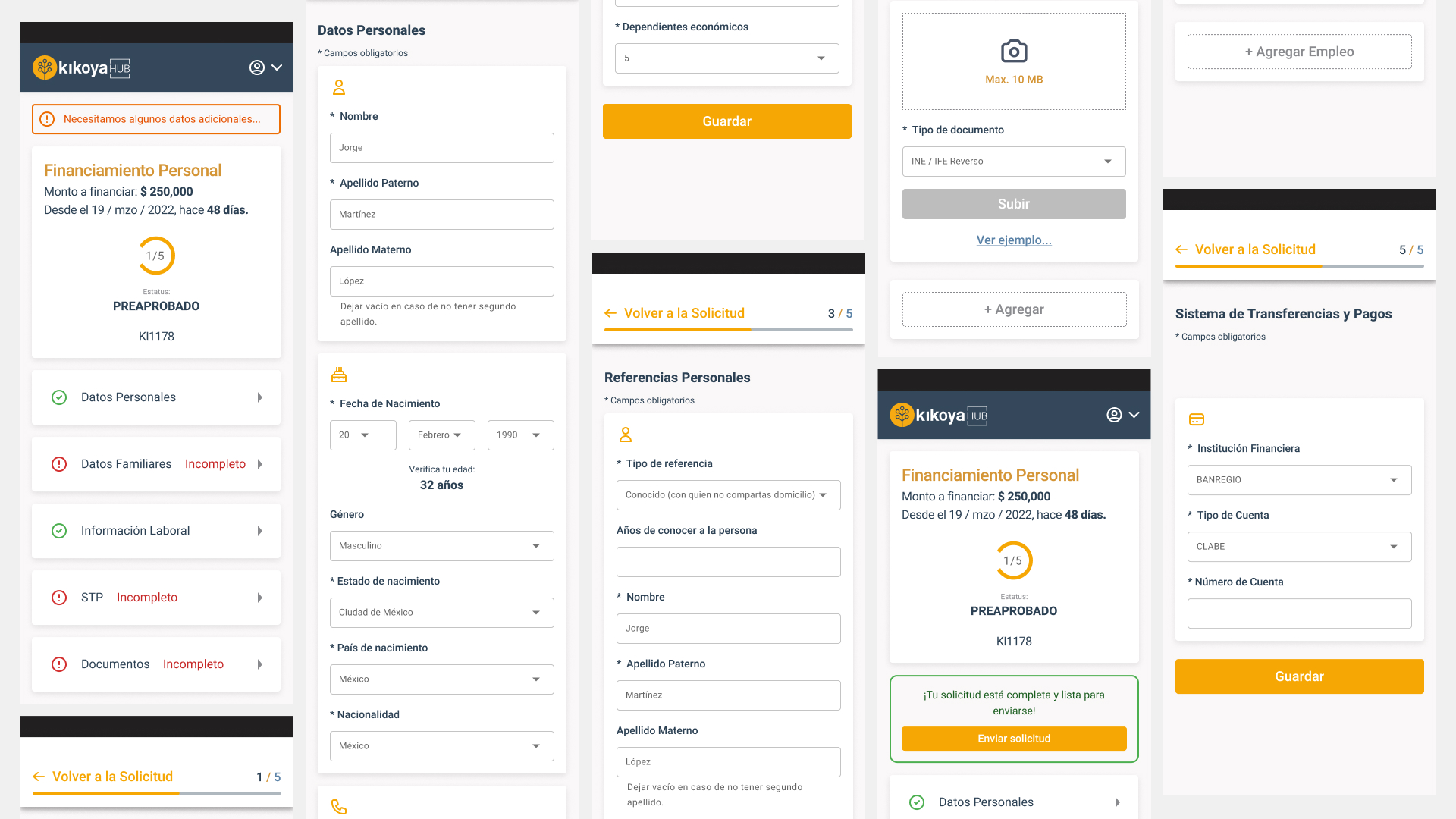
Users main complain was the “traffic-light” user interface, wich have proven to be unintuitive. This was completely redesigned using common design patterns. I started with a mid-res prorotype with this solution.
Next step was to test the prototype. Using Figma I elaborated a test ready prototype and picked 6 participants with applicants alike characteristics. Maze was used to validate the test and all of them were able to conclude the user flow.
Then I proceded to dedign the UI of the form, enhancing its aestetics and using common design patterns.


