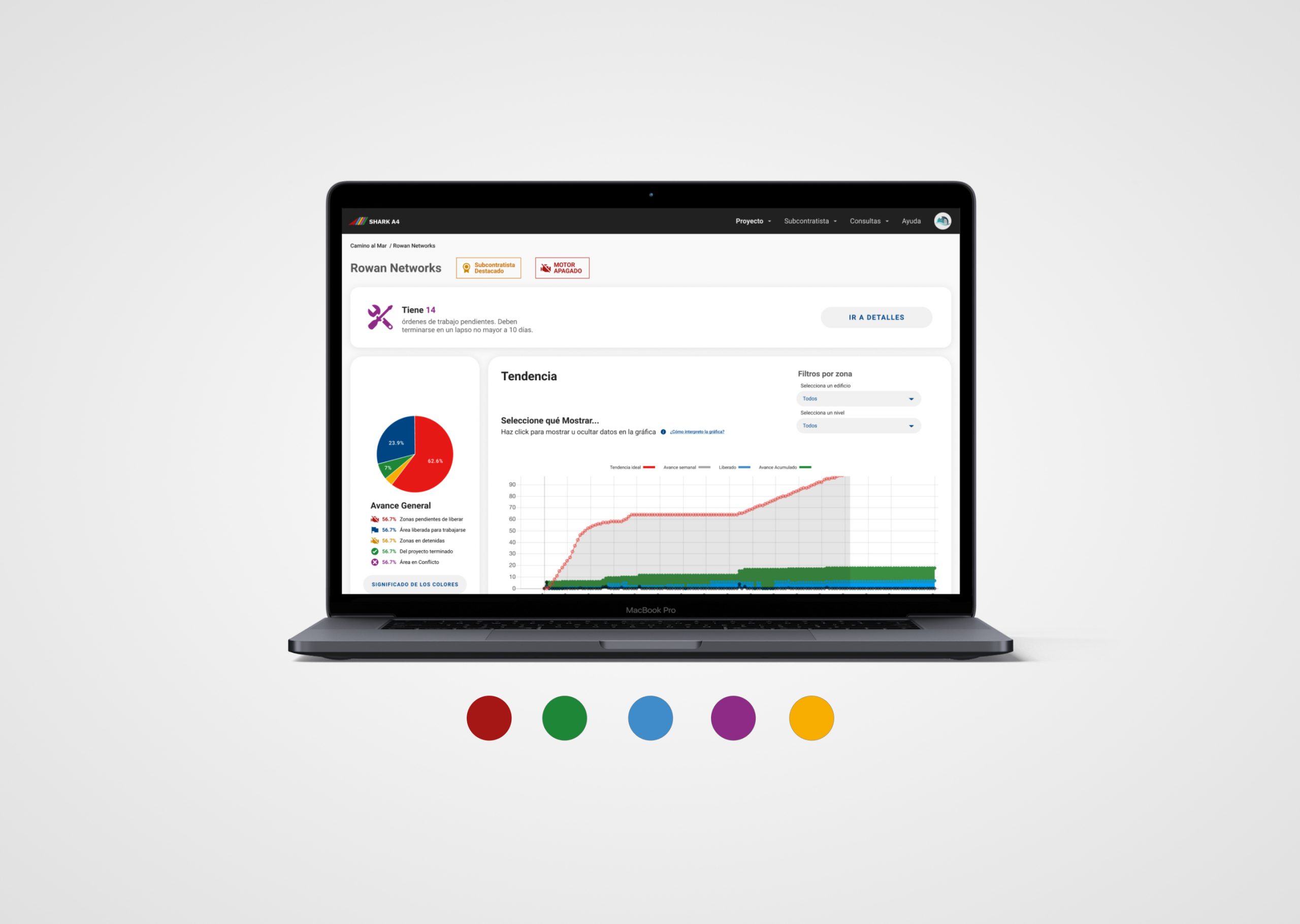
Generate a redesign of the Shark A4 User interface. This is a web platform that is mainly displayed on a desktop, specialized for the construction industry, that has grown in functionalities for 3 years. It began its frontend development using free templates and at the time of preparing this document there were in charge of the backend side and frontend of 4 fullstack developers. Users have severe difficulty in its use, both due to the elaborate information architecture and the lack of clarity in the description of functions.
This occurs in a context where this particular software has little acceptance among it’s users because it’s poor user experience.
Objetives
- Define Minimum Viable Product of a User Experience Redesig to get it on production as soon as possible.
- Make it comprehencible and usable
- Renovate overall comunication and branding
- Ensure the correct usage of the platform


For the research I conducted interviews on te staff of several construction workers currently using the software: Supervisors, coordinators and constractors. Those are the ones in charge of uploading the most of the information.
–Manager
“Supervisors rely a lot on me to teach them how to use the software”
It is not very intuitive, I prefer using more flriendly alternatives
–Supervisor
The software is being taken as if it was a detailing survey app, but it’s main characteristic is unnapreciated
–Contractor Chief and CEO

It was detected that:
· Some UI elements were misplaced, regular searches have a long path of clics
· Actions didn’t have a proper feedback or no feedback at all
· Navigation was counter intuitive
· The communication tone was rude and aggressive.
Information Architecture
First step was to audit and inventory all features of the patform. Card sort a structure for it’s contents.

Screens were mid and high res prototyped and tested with managers. Some features were out of the first iteration scope.

Some querys were being manually consulted regularly to send to contractors and investors, so this specific information was integrated right into the UI.
The voice ant tone was determinated to be simple to understand

A tutorial flow was also integrated.

The Design System
It was generated on figma, due to it’s extension for illustrating purposes just a fraction it’s displayed.


